Kova Patisserie | Branding | Private Commission
Kova is an up-market coffee shop with four different venues across London, and a permanent spot at Selfridges’ food court. They focus solely on the crafts of Japanese Patisserie and beverages.

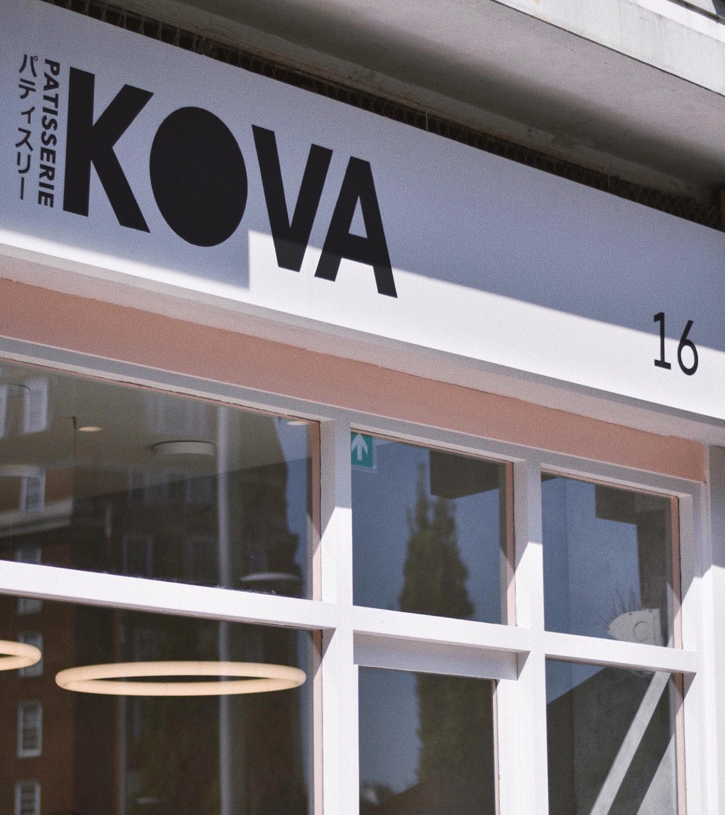
The key to developing their brand identity and tone of voice, was to create a bilingual logo mark, that would not alienate their international audience, and would stand out across a staturated market of coffee shops and bakeries in the city.

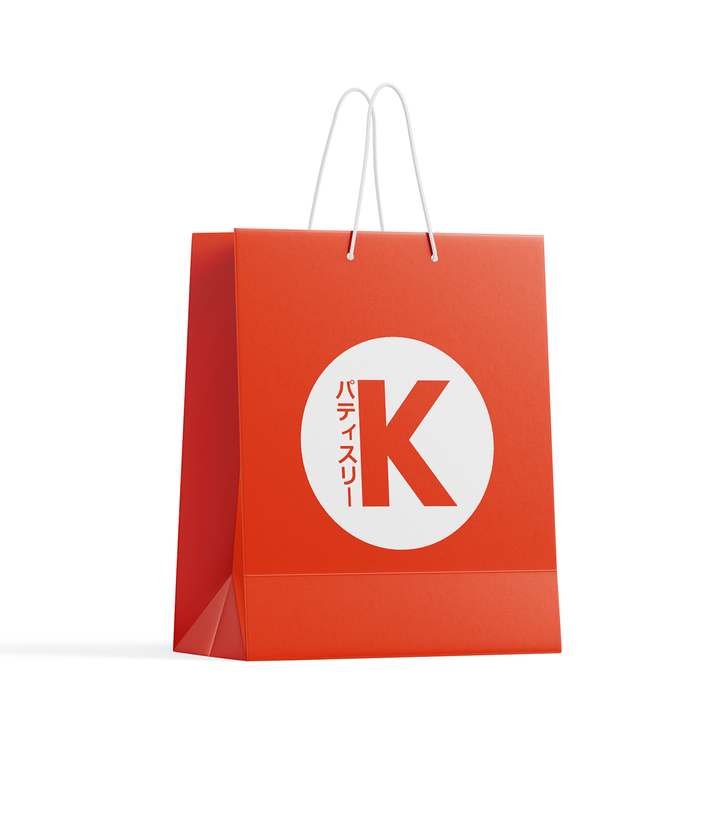
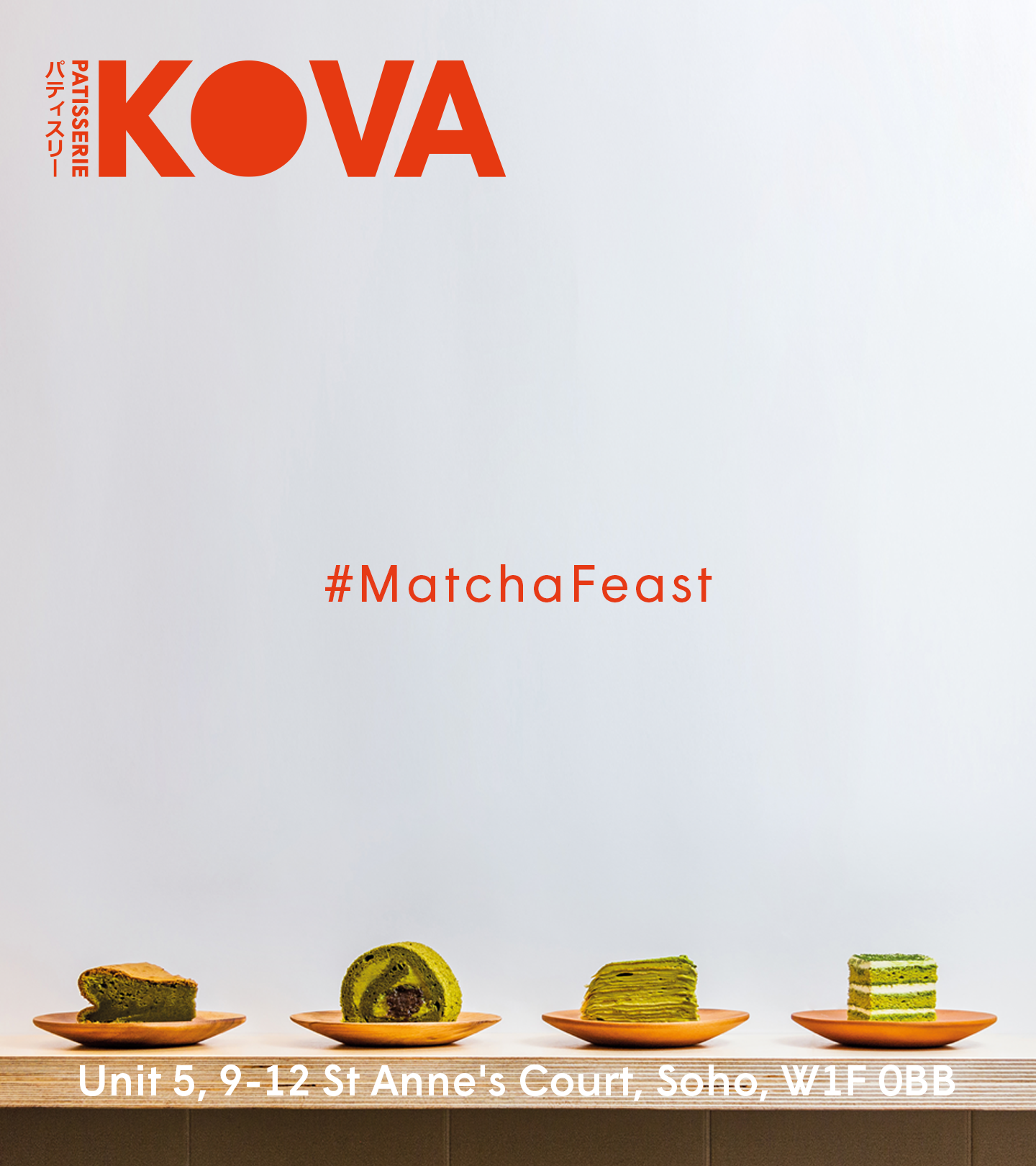
The foundational desing pillar for the brand identity, is the red “O” mimicking the circle of the sun on the japanese flag, which works as a visual anchor, whilst tied to the japanese origins of everything on their menu.
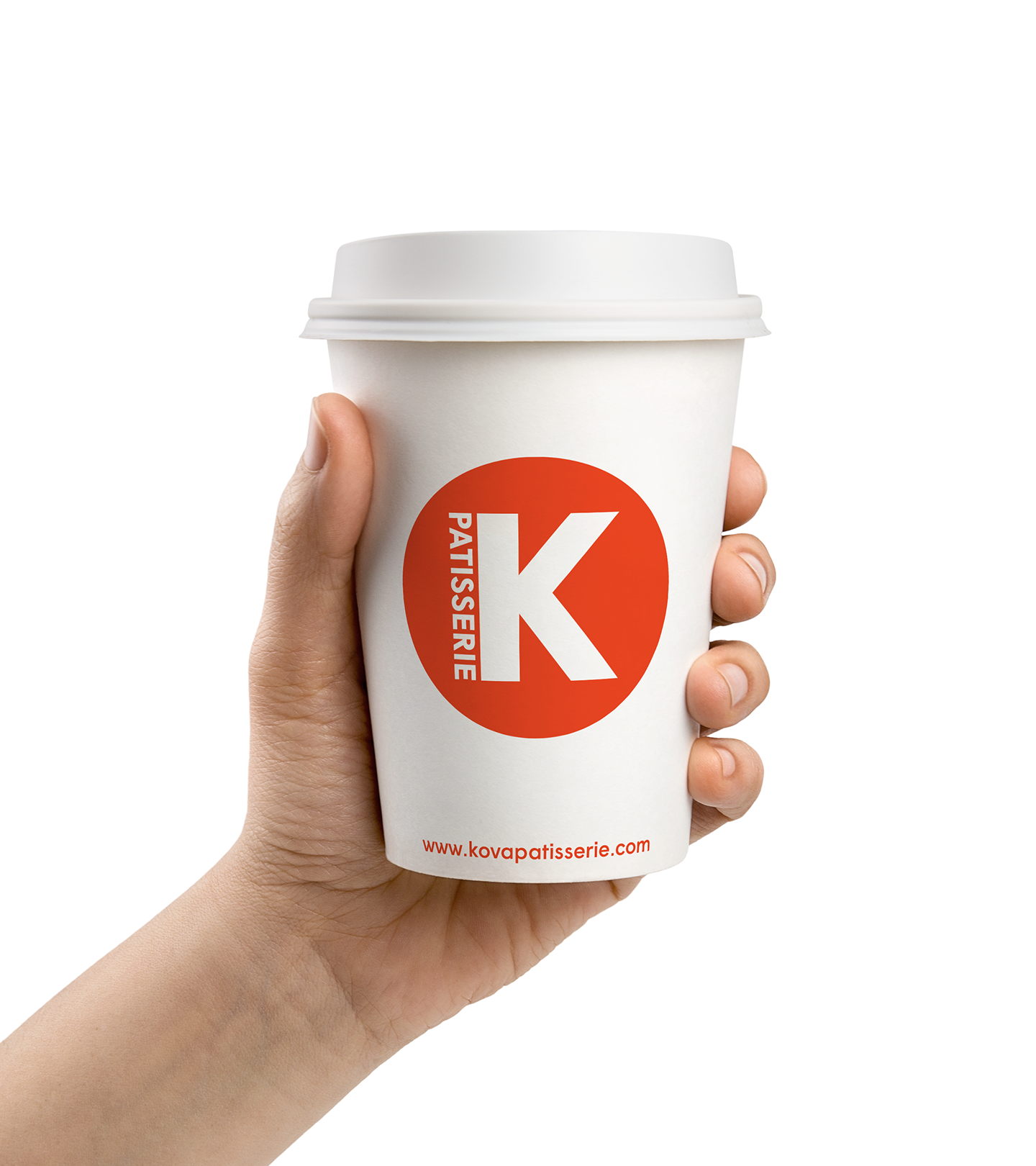
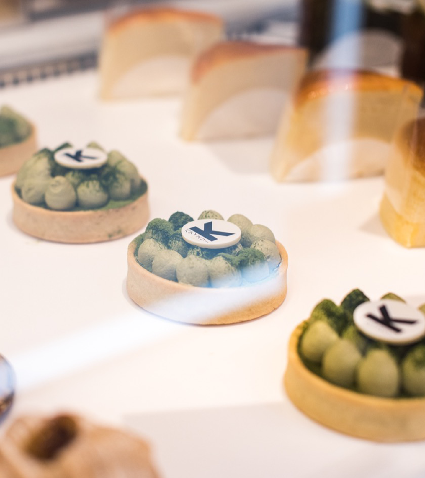
The circle is also used as the support for the secondary logo mark, when the canvas size does not allow for the application of the full logotype.
The circle is also used as the support for the secondary logo mark, when the canvas size does not allow for the application of the full logotype.
